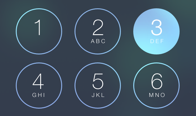
So I got a bee in my bonnet about the buttons on iOS 7 that change color when you tap them. You know, like the ones on the screen unlock keypad and the phone dialer.

I love the way that they are animated: the color change happens almost instantaneously when you tap, but the fade out happens more slowly.
I figured this should be doable in HTML/CSS too (with a bit of jQuery to help). So here is the result (in Foundation, of course). (It's in a frame—you can scroll it.)
(Or view the example not in an <iframe>.)
I think it works pretty well.
The standard button is light colored, for use on dark backgrounds. There is a dark class that makes the button darker, which is good for lighter backgrounds.
And just like Foundation's built-in buttons (shown above for comparison purposes), adding the disabled class makes the button appear disabled.
I haven't gone the whole hog and made matching classes for all the different Foundation buttons (different sizes, rounded corners, different colors, etc.)
If you want to use it yourself or just try to figure out how it works, you can take a look at the source or view it on GitHub.
I'd love to hear your thoughts and any questions you might have. Ping me on Twitter: @martinpolley
And if you're interested in how to steal/copy other people's ideas, I'll be explaining how in an upcoming post. (If the idea makes you feel a bit uneasy, think about it like this: copying is how good ideas spread.)
Make sure you don't miss it—sign up for my newsletter over there on the right.

