

UPDATED 21 Jan 2014: After some nice folks pointed out that my examples were a bit lacking in the accessibility department, I added for attributes to associate labels with inputs, fieldset and legend instead of a regular title, and added an explanation of why labels inside inputs are really not a good idea.
UPDATED 30 Jan 2014: I added a section to explain how to take advantage of responsive design to rearrange the form depending on the screen size (right-aligned labels on big screens, top-aligned labels on small ones).
UPDATED 12 August 2014: The three subsequent posts in this series were published on Boxes and Arrows: part 2, part 3, part 4.
Forms can be tricky. They are one of the most important parts of any site, but they are easy to get wrong. There are so many things to think about:
- What information do we actually need from the user?
- Which are the right input types to use?
- Is that true for mobile too?
- What should the different inputs be called?
- How should they be grouped?
- What should the titles of the groups be?
- Do we need help text?
- Where does it go?
- When should we show it?
- Do all of the inputs need to be visible all the time?
- How and when should we validate?
- How should we highlight errors?
And so on and so on.
This series of posts doesn't answer all these questions for you. There are lots of great resources out there that already do that. (Like Luke's book. Or Justin's article.)
No. What this series does is give you the how.
How to do what though? How to prototype a form in HTML, so that you can put something together that looks, works, and feels like the real thing. Which you can then use for usability testing, for getting stakeholder buy-in, and as a living specification for developers.
You know how you want to lay out your form. This shows you how.
You've decided that right-aligned labels are right for this form. This series explains how to do that.
You know that when the user enters something invalid, you want a message at the top of the form and to highlight the problem input. There's a post that's got you covered.
Layout
If you've read any of my previous posts, you'll know I'm a fan of Foundation, Zurb's front-end framework. Its responsive grid makes laying out pages a cinch. And the same is true for forms.
I'm not going to explain how to download Foundation and set up a project. You can refer back to this post for that. I'm going to assume you've got a project set up and are sitting in front of a text editor with index.html (from Foundation) open, the default content deleted, and ready to start adding your own stuff. (I'm using Foundation 5.0.2, the latest version at the time of writing.)
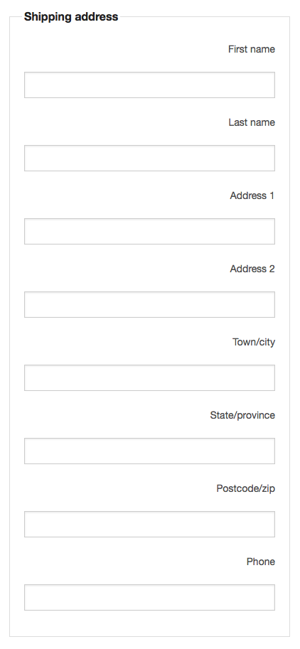
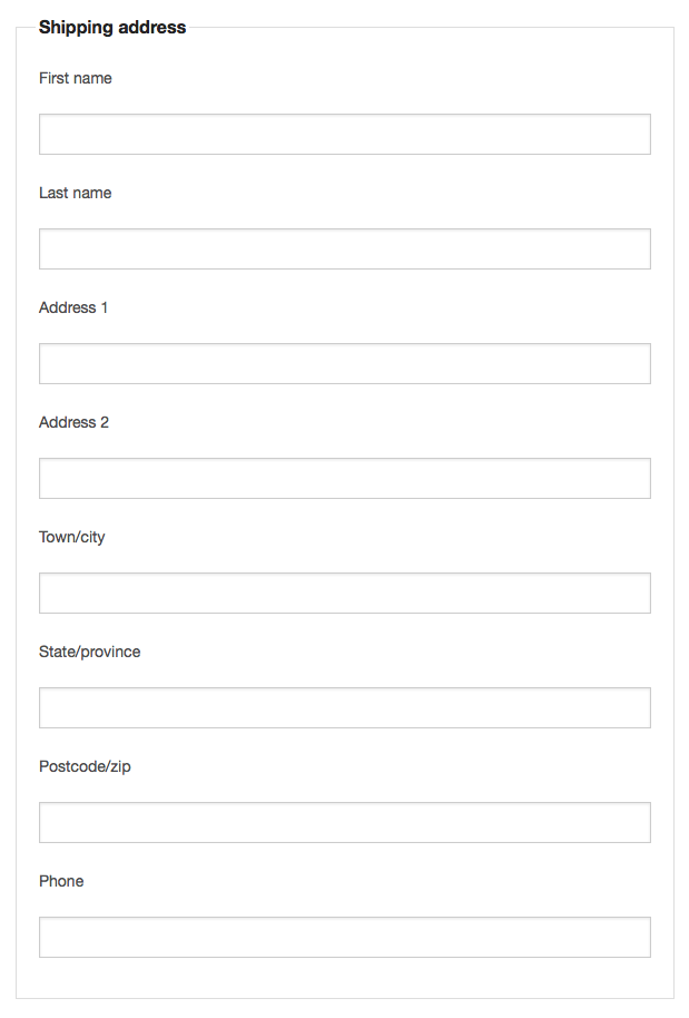
So let's say you're designing a form where the user enters their shipping address. You want it to look like this:
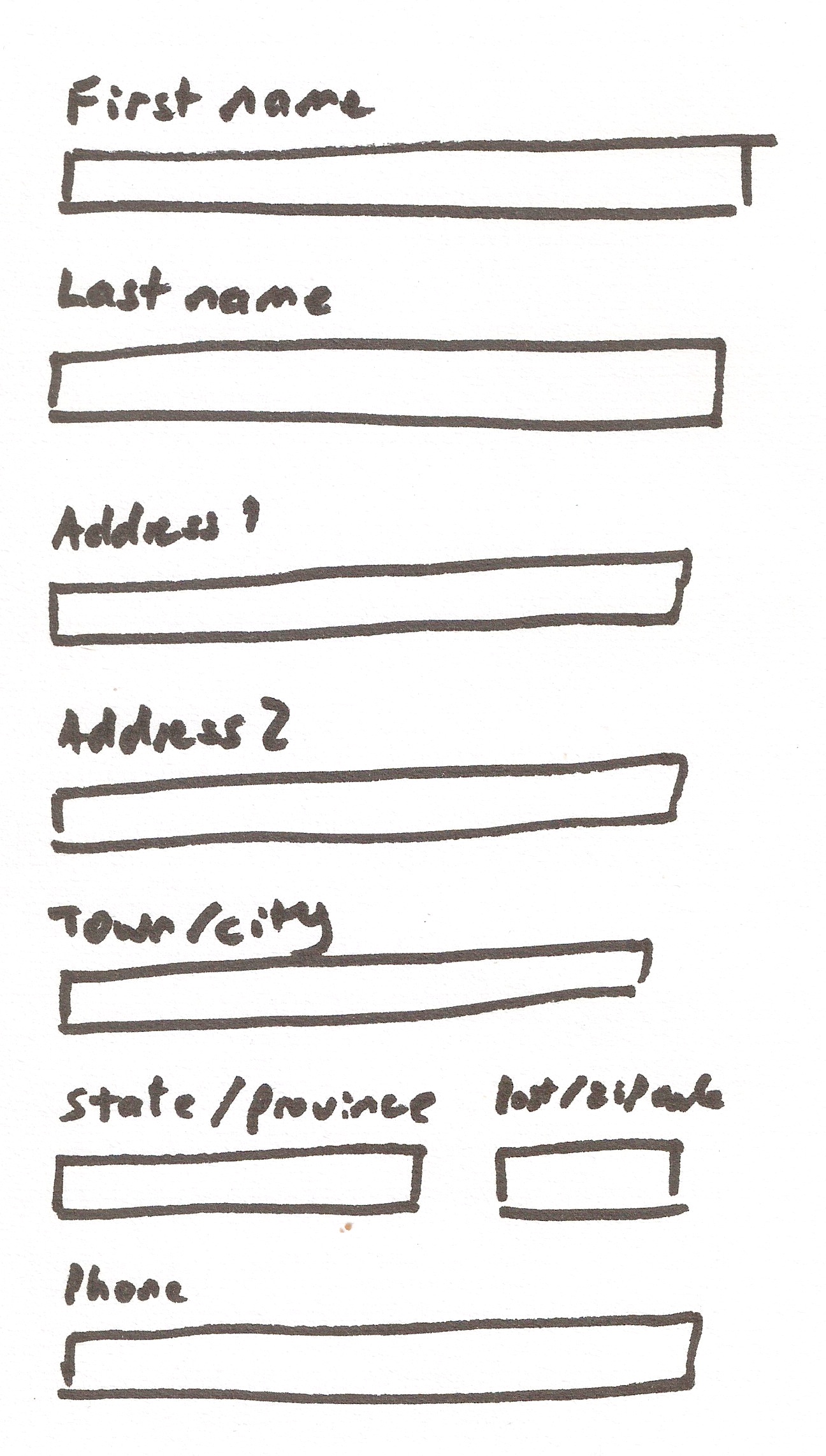
No worries! All we need to do is add a <div> that has the Foundation row class for each row of the form, and for the row that has two inputs, we just add a <div> with the right number of Foundation columns for each input. Add this to index.html:
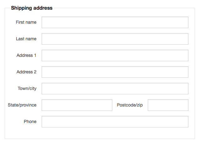
Which comes out looking like this (this is embedded, and you can scroll it):
OK, what did I do here?
This is a form, so we've got a <form> element wrapping everything else. Inside this, there's a <div> of class row. In Foundation, you have rows that contain columns.
Then there's another nested <div> with a class of large-8 small-centered columns. All this does is squish the form down a bit horizontally. It's not necessary at all, but without it the form is really wide.
Next we've got a <fieldset>, which groups the form items together, and a <legend> that gives the group of elements a title.
After that we've got the actual meat of the form: <input> elements and their <label>s. Each such pair is just a <label> element immediately followed by an <input>. This stacks them one above the other. (A bit later, we'll see how to do left- and right-aligned labels.)
Notice that each <input> has an id, and that its <label> has a for attribute with the same value. This is important for accessibility—it tells screen readers what belongs to what so it can read things out correctly.
Most of these pairs are wrapped in <div>s with a class of small-12 columns. This tells Foundation to make them twelve columns wide. (The Foundation grid is based on twelve columns, so this means it takes up the full available width. And because Foundation is mobile-first, we use small-12, which applies to both small and large screens, then if we want to do something different on large screens, we add a large- class as well. Here we don't, so small- is all we need.)
The only row that isn't like this is the one containing our State/province and Postcode/zip <input>s. Here, we've got two <div>s, one eight columns wide (small-8 columns), and one four wide (small-4 columns). You can divide the space up whichever way you like, but the number of columns mustn't be more than twelve. It can be less, but then you'd have a gap on the right. (Try it and see.)
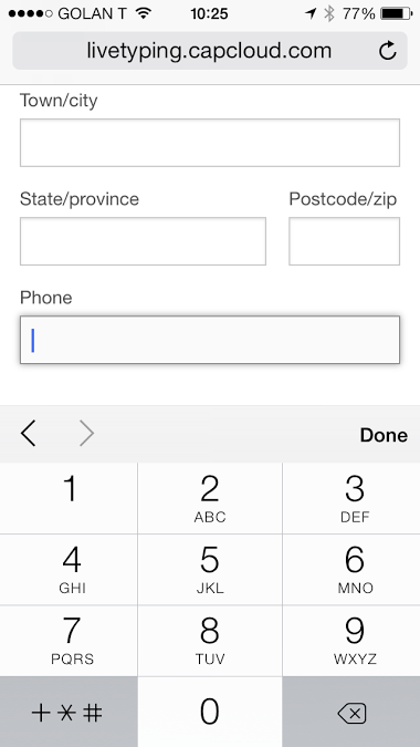
All the <input>s have a type of text, because they are for entering text. Except for the phone number <input>, which has a type of tel. In desktop browsers, this works exactly the same as a text input, but on mobile devices, you'll get a phone keypad instead of the normal keyboard:
If you open this up in a browser, you'll see the layout is just how we want it. And if you make the browser window narrower, the layout is maintained.
If you want the layout to change on small screens so that all the fields are full-width, change the classes for those two columns from small-8 and small-4 to large-8 and large-4:
That tells Foundation only to make them side-by-side columns on large screens. On small screens, they'll be stacked one above the other. Check it out here. (Opens in a new tab.)
Label Alignment
Let's reuse the layout example to play around with the alignment of the labels. There are several different options for label placement.
Top-aligned:
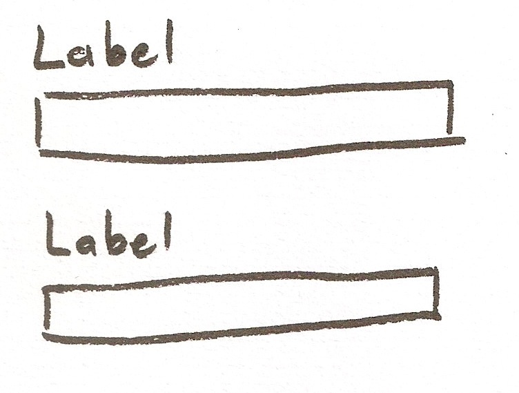
Left-aligned:
Right-aligned:
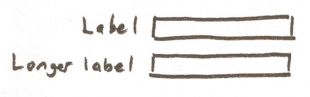
Labels inside inputs (which lots of folks agree are a bad idea):
The form already uses top-aligned labels. So how do we do the others?
Simple, we just use Foundation columns again. Let's start off with left-aligned labels.
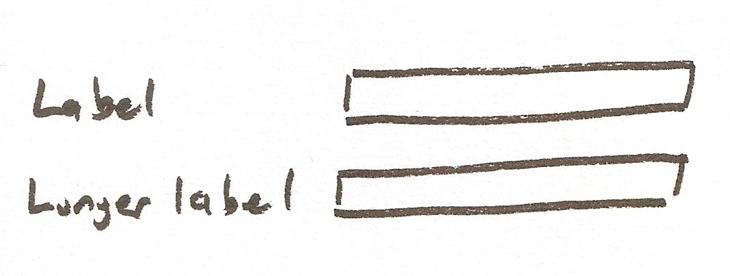
Left-aligned labels
We just need to change our markup to look like this:
All I've done here is put two columns in each row instead of one as it was before. I've given the labels two columns width and the inputs ten columns. And where we had two columns before for State/province and Postcode/zip, now we have four: two for the labels and two for the inputs.
Note that I've added the align class to the labels. This is a Foundation class that makes the labels line up vertically with the inputs. (Try removing it and see what happens. It's not pretty.)
Here's what it looks like now:
Right-aligned labels
To make the labels right-aligned, all we need to do is add the right class to each label:
Which looks like this:
Responsive jiggery-pokery
It’s all very well having a form that looks just the way you want on a big screen, but using the exact same layout on a small screen doesn’t always work. (Try opening the last example on your phone—it looks rubbish.)
We can use Foundation’s responsive grid to make it work better on small screens. In that last example, we used the small- classes to set the width of the labels and inputs. That means that this is the way we want them to look on small screens and anything bigger than that.
If we change small- to large-, what will happen is that we will get this layout (labels and inputs on the same line) only on large screens (i.e., above 1024 pixels wide). On smaller screens, the labels will be above the inputs, just like in the first example. Try it yourself and see what happens when you shrink the width of the browser window.
The width at which it jumps from an all-on-one-line layout to a stacked layout is a bit too wide though—the side-by-side layout works just fine on tablet-sized screens as well as desktop-sized ones.
So what we need to do is use medium- instead of large-. This means that for medium (tablets) and large (desktop) screens, we get the right-aligned labels (or left-aligned, if that’s what you want), and on small (phone) screens, the labels are top-aligned.
But if our labels started out right-aligned, they stay right-aligned even on small screens. And that’s just wrong:
Foundation doesn’t give us a way to handle this, but if we dig a little under its responsive skin, we can make things work the way we want.
Responsive designs use CSS media queries to rearrange their layouts depending on the screen width. All we need to do is add one media query to our CSS to make it all better.
Create a file called form.css and save it in your project’s css folder. Add this to the new file:
And somewhere inside between the <head> tags in index.html, add this line:
This CSS rule looks a bit intimidating, but all it says is this: if the width of the browser viewport (i.e., the width of the content area of the browser window) is 640 pixels or less, apply this rule.
And the rule that gets applied in this case says to align the label text left and to float it left as well. (Originally <label> was floated right and its text was right-aligned.)
Why 640 pixels? Because that is the width (the “breakpoint”) at which Foundation changes the page layout for elements that have a medium- class. (There's another one at 1024 pixels for large-.)
This is how it looks:
Large/medium:
Small:
Open it up in a new tab and see how it behaves when you change the width of your browser window.
Labels inside inputs
To put the labels inside the inputs, let's just take our first alignment example and remove the labels. Then for each input, we'll add a placeholder attribute that contain the label text:
Here's how that looks:
It's nice and clean, but once you start typing in an input, the label disappears, which can be problematic. And the lack of labels is a real problem from an accessibility perspective—screen readers typically don’t read placeholders like they do labels.
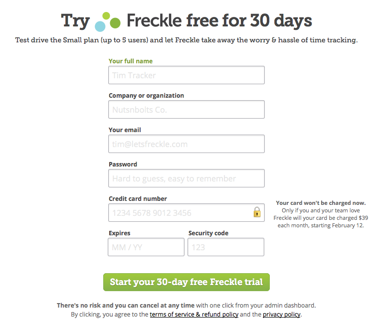
What lots of sites do is have regular labels and use the placeholder attribute to show you the kind of thing you're meant to enter in each input. Freckle, the time-tracking app, does this to good effect:
Conclusion
That will do for now, I think. In the next post, I'll be showing you how to group inputs. I'll also show you all the different types of inputs that you can use.
Make sure you get it by subscribing to the feed. Or better still, by signing up for my newsletter below.
If you liked this post, you should really check out my upcoming book, Prototyping Forms. Just like this, only more and better!