"Good artists copy, great artists steal."
So said Steve Jobs, attributing the words (incorrectly) to Picasso.
It's my firmly-held belief that stealing is A Good Thing. I don't mean you should try to saunter out of your local supermarket with a bottle of expensive Scotch secreted in your trousers. Nor do I mean that I think it's OK to rip off the entire visual design of a site and use it on the one that you are designing.
I mean that stealing a good idea and using it your own design is good for you and good for the idea. This is how good ideas spread. Take the archetypal example: pull down to refresh, first introduced in Tweetie by Loren Brichter. Twitter bought Tweetie and it became the official Twitter client for iOS. And the pull-to-refresh pattern has been copied by just about every feed-based app out there.
Another example is the swipe-from-edge gesture that many apps (including Apple’s own Mobile Safari) use to let you go back to the previous page. This gesture (originally from Blackberry, I believe) has become so ubiquitous that it’s downright annoying to come across an app that doesn't use it.
How ideas spread
Of course, it's not just gestures. Every commonly-used control, widget, or pattern started off as an innovation that spread by copying. Others never really worked well enough to be copied, and died out. It's like Darwinian evolution. The fittest ideas live to reproduce (get copied), while the weaker ideas become extinct.
So how do we find out about these new species? And how do we go about copying one once have discovered it?
Finding good ideas
One way is to expose yourself to new things as much as possible. Try out new apps and sites. Look at what people are doing on Dribbble. (It's mostly visual design stuff, but if you dig, you can find some interesting things, such as this.) Follow other designers on Pinterest and see what they are pinning. (Like this.) And when you come across something interesting, grab it and stick it somewhere. Bookmark it. Take a screenshot and put it in a dedicated Flickr album. Put it in Evernote or Dropbox. You could even Pin it.
Another way is to regularly check out some of the many pattern libraries. See the new things that are being added. (There are quite a few libraries like this.)
But then what? You're working on a design and you think “That new pattern that I saw on <wherever> would be perfect for this!” How do you actually go about incorporating it into your design?
Using a good idea
Well, it depends. If you’re at the sketching stage, it’s only limited by your sketching abilities. But if you're wireframing or making a prototype, it really depends on the tools or technology you’re using, and the platform you're designing for. If you're using OmniGraffle or Photoshop, you can probably make a visual representation of it, maybe in the form of a storyboard of some kind. But it's not ideal.
If you're using something like Axure, you're going to have to try and find the widget or pattern in one of the existing libraries, or figure out how to make it yourself.
If you're designing a mobile app, you'll probably want to get cozy with a developer who can put something together in code. (Though Facebook's Origami looks promising for this sort of thing.)
But if you're designing something for the web, and making prototypes in HTML, then you're in luck. Especially if the thing you want to copy also lives on the web. That means that it's been done. It's technically feasible. And because web sites and apps work the way they do, you can pick them apart and see how they work.
How, exactly? Read on, friend.
The web makes stealing easy
Every browser lets you view a web page's source. And these days, all browsers include tools that will let you dig into this source code and really figure out how it works. (Chrome has its Developer Tools. Safari has its Web Inspector. Firefox has its Web Developer Tools. And even Internet Explorer has its F12 Web Developer Tools.) There is also a large number of browser extensions that provide similar or additional functionality (such as Firebug for Firefox).
So let's run through a quick example.
Stealing: a practical example
Mailchimp is a service that lets you send email newsletters. One thing that sticks out about it for me is its form controls. Instead of the standard browser controls (which look different on different operating systems), it uses custom elements. As well as looking nice and being big and easy to click, they look the same on PC, Macs, phones, whatever.
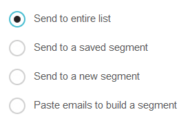
So how do they do it? I opened up Mailchimp in Firefox (where I already have the Firebug extension installed). Their radio buttons look like this:

Nice, eh?
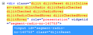
I right-clicked on one of the radio buttons and selected "Inspect with Firebug". The CSS for the <input> element didn't tell me much, but I noticed that when I hovered over the radio button, some extra classes were being added to the <div> that contains the <input>:

(Firebug highlights things that have just changed in yellow.)
This suggests that they're actually using this container element to make the radio buttons look and behave the way they do, rather than trying to do anything to the <input> element itself. And the classes that are being added all start with dijit. What the heck is Dijit?
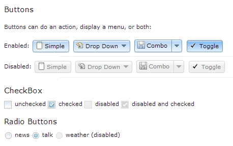
Well, it turns out that Dijit is the UI library for Dojo, a JavaScript framework (kind of like jQuery, which has the jQuery UI library). Poking around on the Dojo site, I found something called the Dijit Theme Tester. It has nice-looking radio buttons (that don't look like system radio buttons):

But they don't look like the ones in Mailchimp… Looking in Firebug again, I can see that the <div> in question is getting a background-image applied to it:
![]()
This image is what's called a sprite. It's a single image file that contains a number of separate images. Here, I can see that it contains images for all the different states of the radio button, as well as the same for checkboxes. Here's how it looks full-size:

If I go back to Mailchimp, I can see that they use a different sprite:
![]()
Here's what that looks like full-size:
As you can see, this is how they make the same Dijit radio buttons look different (that is, better).
Enjoying your ill-gotten gains
So if you wanted to do something similar in your own prototype (or production site/app for that matter), you now know that you can use Dijit and make your own sprite image to customize the way it looks.
But please, don't just steal the Mailchimp one. That would be wrong :). (Especially as Mailchimp are nice enough to explain how their forms are made over here.)
If you're interested in HTML prototyping (because so many UX job postings are asking for front-end coding skills these days), you should check out Livetyping, my HTML prototyping course for UXers.
And if you like stuff like this, you should sign up for my newsletter:

