I was thinking about how we relate to our music. And specifically how this has changed with the move from physical media (vinyl, tapes, CDs) to digital music that has no physical manifestation.
In the old days (eight, ten years ago) you would have CDs on shelves. Maybe some old tapes and vinyl albums in a box somewhere too. Your CDs might have been organized alphabetically. Or maybe by genre. Maybe even by color.
But if you are like me, the stuff that you listened to most often would be the most easily accessible (for me, that means the top shelf). The stuff I listened to less often (or never) would be on the lower shelves. And some would even be in a box in a cupboard or in the attic, gathering dust.
But these days we have iTunes. And all your albums are there, on an equal footing, as it were. Sure, you can order stuff by number of plays or date last played, but it's not very elegant. (Try ordering by plays and see what a mess it makes of cover flow—it doesn't show an album once, but once per song.)
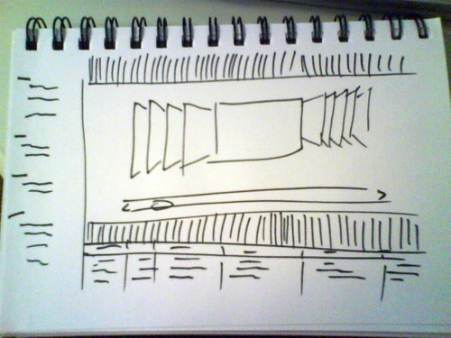
Maybe we could take a cue from the physical world, as Apple is urging us to do when it comes to designing iPad apps. Perhaps cover flow could have shelves.
The top shelf would contain the albums you have listened to the most, but somehow taking time into account too. An album that I listened to continuously for two months three years ago but have hardly listened to since would drop down to the second or third shelf. Maybe an album like this would accumulate a layer of dust, which I could choose to blow off now and again by listening to the album.
And why limit it to music? Why not books as well? Why not movies? Why not games? And what about documents? Spreadsheets even?


